


Ranking Every City Connect Uniform So Far: 20-16
Today we're looking at my personal favorites from the City Connect series. Get ready for some hot takes.

Starting in 2021, MLB announced a series of “City Connect” uniforms that have been slowly released over the last three seasons. The new uniforms have produced a series of mixed reactions amongst MLB fans. Some teams have absolutely nailed it (looking at you, White Sox), while others have unfortunately missed the mark. The uniforms will be ranked in their current state, acknowledging any tweaks and modifications the teams have made since their release. 19 of 30 teams have released their City Connect uniform, with the Pirates set to join them on June 27th. The ten remaining teams will release their uniform alternates over the span of the 2024 and 2025 season.
20. The Atlanta Braves

Atlanta Braves on Twitter.com
Does anyone think that these uniforms are eerily familiar? Perhaps a little too familiar?
The Braves sought to honor Hank Aaron and the 1972-1975 uniforms that the Braves wore when Aaron hit his 715th HR with this release, with some minor changes to update the uniform from its 70s counterpart. “Braves” across the chest has been switched to “The A”, slang that Atlanta natives use to describe the city. The inner lining of the jersey has “715” on the neckline, but this detail is unseen to viewers. Aaron’s famous motto, “Keep Swinging”, has been added in a golden font to the jock tag of the jersey, names have been added to the back, and the blue trim near the shoulders has been expanded across the neckline. And…that’s it for the changes.
If I was judging this simply by aesthetic, I think I would rank these uniforms a lot higher. They are objectively good looking uniforms, but the lack of deviation from a fifty year old uniform make these easily the most disappointing entry in the City Connect series thus far. It does not help the Braves case that this jersey has been worn recently as an alternate, so these jerseys are not particularly ‘new’ to fans. And if I am being completely, 100% honest…the throwback jersey did it better. The only addition that I like from the new version of this jersey is the green brim under the hat. But they took away the lowercase A logo, so it’s gonna be a no from me, dog.

Atlanta Braves on Twitter.com
A Potential Fix: The City Connect uniforms has been an opportunity for teams to explore new colorways, and rather than do that, the Braves leaned on an old classic. I understand that this was supposed to be a tribute to Hank Aaron, but the lack of creativity is disappointing. I suggest the Atlanta Braves make this uniform an alternate and try again. We will all collectively block this out of our memories.
19. The San Diego Padres
 celebrates with teammate Ha-Seong Kim (7).")
Gregory Bull, Associated Press
I’m sorry, Padres fans. There’s simply too much going on with the uniforms. The intention was to bring out the bright and vibrant culture of San Diego, but I think that the designers of this uniform were trying to do too much in the design process. The pink clashes heavily with the seafoam green, and is rough on the eyes. But what do I know? These uniforms, reportedly, have been flying off the shelf in San Diego. As an East Coast sports fan, I am clearly not the target audience.
Positives? The seafoam green helmets on the uniforms are so, so clean. The pink accented San Diego logo is the cherry on top of a great hat/helmet combo. It makes me wish that San Diego had focused their energy more on the pink and seafoam green, rather than the yellow. If there is one positive I can speak to, however, it is how these uniforms allow players to integrate their own colors into the uniforms with arm bands, cleats, and other accessories. If you are going to be loud and abrasive, you may as well go all out.
A Potential Fix: I think adding a little black in the uniform to contrast with the pink and teal would go well. I would avoid adding too much black, but accenting the color on the borders of the uniform may make these a little more palatable. Perhaps remixing these uniforms and taking white away as the base color would make them stronger. I have posted a mockup below by Twitter user @BrianVilven could be a possible change to the uniform.

Brian Vilven, Twitter.com
18. The Chicago Cubs
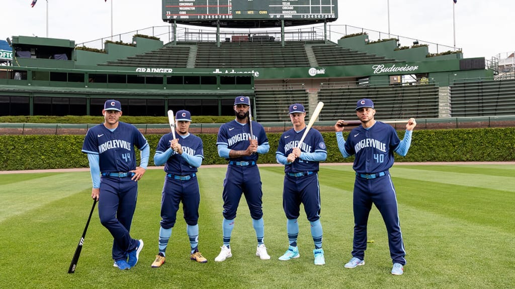
MLB on MLB.com
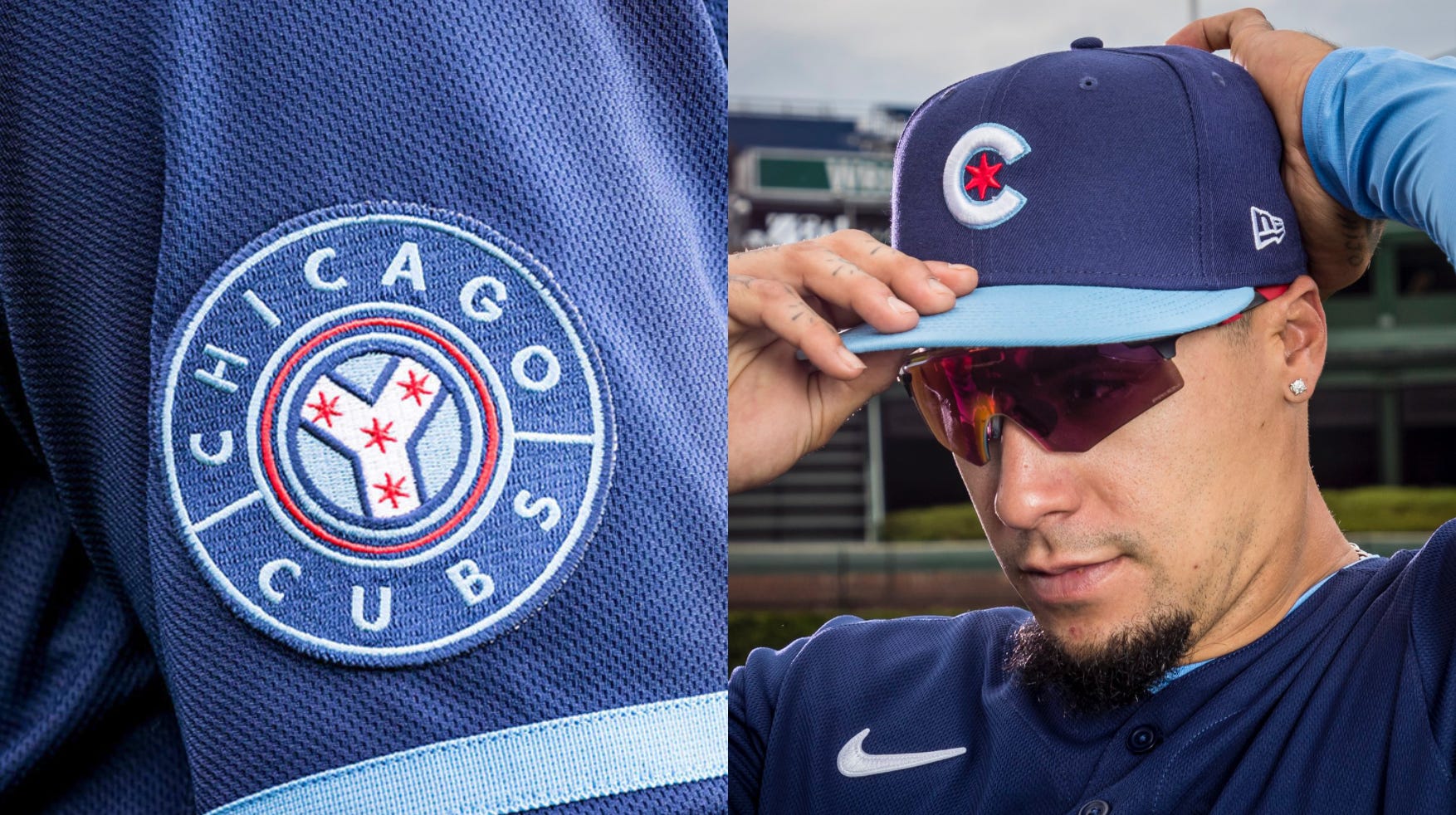
It may surprise some to see the Cubs City Connect uniforms this low on the list, but I am thoroughly unimpressed with the design of this jersey. With “Wrigleyville” adorned across the chest, it honors the area surrounding the ballpark. One of the best details (that is absent from the on-field uniform) is the names of Chicago’s 77 neighborhoods on the sleeves of the bullpen and dugout jackets. There is no visual contrast on the uniform, as the light blue on dark blue results in a very monotone uniform, despite the color difference.
The uniform is not all bad, however. The Y patch on the sleeve, representing the convergence of the Chicago River, is very nice. The hat, with the red Chicago star in the middle of the Cubs logo, is an excellent cap design. The subtle representation of the Chicago flag makes this hat one of the better hat designs to come out of the City Connect series. As someone who owns way too many hats…this one will be in the collection.
Chicago Cubs on Twitter.com
A Potential Fix: The detail of Chicago’s 77 neighborhoods is one of the best things that his jersey has to offer. The Cubs need to find a way to work these details into the uniform. Perhaps they could use an interior print, similar to the Orioles city connects, to display the neighborhoods names on the inner sleeve and button area. Otherwise…their Field of Dreams throwback uniform was significantly better.
17. The Baltimore Orioles

Baltimore Orioles on Twitter.com
Baltimore fans can thank Atlanta, San Diego, and Chicago for helping them to avoid last place on this list. Truthfully, I was very excited for Baltimore’s City Connect uniforms, as the color scheme of orange, white and black has a lot of room for experimentation. Not only that, but the team’s multiple logos throughout its existence would give designers a lot of pathways to tread. Unfortunately, it appears that Baltimore employed the designers of Great Britain’s World Baseball Classic uniforms. The design is undoubtedly better than the three that preceded it, but it’s boring.

Baltimore Orioles on Twitter.com
One of the details that I do like a lot, however, is the interior design of the jersey. It is something that I wish was brought out more on the jersey, as pattern can barely be seen on the field of play. The “B” logo on the hat is a very clean design as well. If I was only ranking the hats from this collection, this hat and logo combination would end up in my top 10. Unfortunately, the rest of the uniform simply does not live up to the hat. For a city with such a rich, detailed history, designers brought in…none of it. I would have accepted The Wire themed jerseys over this.
A Potential Fix: The uniform needs more contrast from its almost completely black design. Bringing out the interior jersey details onto the uniform could be a potential pathway to success, or adding accents of white or orange could work. Additionally, the font on “Baltimore” needs to be modified to something with more character. Hell, use the Old Bay font. Marylanders love Old Bay.
16. The Los Angeles Dodgers

Los Angeles Dodgers on Twitter.com
Before the modifications that the Dodgers made to this uniform, it most likely would have landed last on this list. When these uniforms released in 2022, they featured Dodger blue pants, with a new “Los Dodgers” cap. As one of the inaugural City Connect uniforms, these were a massively disappointing entry. It is understandably difficult to introduce an alternate uniform when your team has only worn two uniforms throughout its existence, but the designers could have tried harder. The only notable feature that pops on the uniform is a touch of black on the sleeve, which is easy to overlook with such a deep blue.
A lot of color combinations can be done with red, white and blue, so it confuses me why the Dodgers picked this to be their city connect. Integrating the red from the number could have been a possible route, as anyone who has walked around Los Angeles for more than an hour has seen their share of red Dodgers hats. It could have made these uniforms much more unique than the standard Dodger blue. If this is the standard being set for teams with only one home and away uniform, I am concerned for the eventual releases of the Tigers and Yankees City Connect jerseys.

New Era on newera.com
A Potential Fix: What the Dodgers have done already to modify this uniform have been massive improvements. In the 2023 season, they switched out the “Los Dodgers” cap for a standard Dodgers cap, and changed the blue pants to white pants with a blue stripe running down the side. Unfortunately, these uniforms do not have much room for improvement. Perhaps some white accenting on the blue jersey? A better route for the Dodgers to go would have been to honor their Brooklyn heritage in a throwback jersey, or go in a complete new direction with a red uniform.
Thank you for reading! I have been hard at work at my thesis to complete my undergraduate degree, which may or may not be posted here when it is complete.